| Value |
Any of the possible values for the **Suggestion field**. |
With a "Value" suggestion, you must also select a **Suggestion field**, which is a search key. The variable's
**Default value** is any of the possible values for that key. When you use the variable in a graph, you set the
value of the variable using a multiselect with all possible values for that key. A filter resulting from
multiple selections is a logical OR of all values.
|
If the **Suggestion field** is "environment," then you can set the variable to any of the environments
available in the graph's data.
|
| Key |
Any of the search keys for the graph's underlying data. |
With a "Key" suggestion, the variable's **Default value** is a search key. When you use the variable in a
graph, you set the value of the variable using a select with all search keys.
|
If the **Suggestion type** is "Key," you can use the variable in function, grouping, or bucketing rules. For
instance, you could create multiple graphs in a dashboard that are grouped by a parameterized value.
|
| None |
Any: the variable's input is free text. |
With a "None" suggestion, the variable's **Default value** can be any string. When you use the variable in a
graph, you set the value of the variable by entering any string.
|
If the **Suggestion type** is "None," this is a freeform variable. You can use it for any function, grouping,
or bucketing rules, and there are no restrictions on what value it can hold.
|
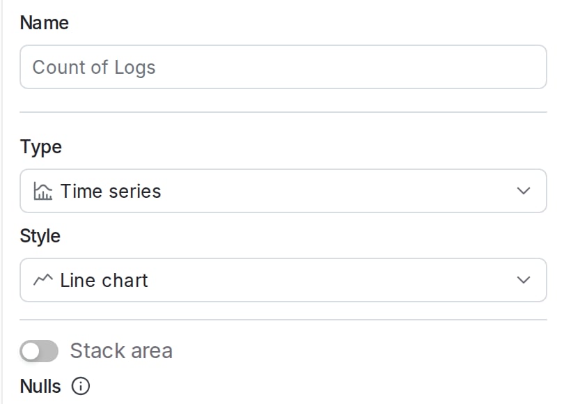 6. Choose a **Source** from the dropdown. You can populate each graph with data from any of the following:
* Logs
* Traces
* Sessions
* Errors
* Events
* Observability metrics
7. (Optional) Select a **Function** from the dropdown to determine how data points are aggregated. "Count" is selected by default. If you choose a function, such as "Min," that requires a parameter, select the attribute to use as well.
8. (Optional) To add an additional function, click **+ Add function**.
9. (Optional) Toggle **Filter** on to select which data points to include in your graph. For example, if you only want to include data from the production environment, set the `environment` filter. To learn more about the filter syntax, read [Search specification](/docs/home/observability/search).
6. Choose a **Source** from the dropdown. You can populate each graph with data from any of the following:
* Logs
* Traces
* Sessions
* Errors
* Events
* Observability metrics
7. (Optional) Select a **Function** from the dropdown to determine how data points are aggregated. "Count" is selected by default. If you choose a function, such as "Min," that requires a parameter, select the attribute to use as well.
8. (Optional) To add an additional function, click **+ Add function**.
9. (Optional) Toggle **Filter** on to select which data points to include in your graph. For example, if you only want to include data from the production environment, set the `environment` filter. To learn more about the filter syntax, read [Search specification](/docs/home/observability/search).
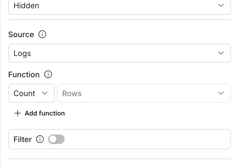 10. (Optional) Toggle **Group by** on to group your query results into separate series. Use the dropdown to choose the category by which to group results. For example, you might group your logs by severity level.
11. (Optional) Specify a **Limit** to restrict the number of groups displayed, and a function type to determine whether a group should be included in the graph.
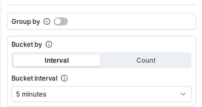
12. (Optional) Toggle **Bucket by** to **Interval** or **Count** to indicate how bucket sizes should be determined.
* Bucketing by interval requires that you set a **Bucket interval**. A higher time interval displays more granular buckets.
* Bucketing by count requires that you set the **Time buckets** value to the number of buckets to display on the x-axis.
10. (Optional) Toggle **Group by** on to group your query results into separate series. Use the dropdown to choose the category by which to group results. For example, you might group your logs by severity level.
11. (Optional) Specify a **Limit** to restrict the number of groups displayed, and a function type to determine whether a group should be included in the graph.
12. (Optional) Toggle **Bucket by** to **Interval** or **Count** to indicate how bucket sizes should be determined.
* Bucketing by interval requires that you set a **Bucket interval**. A higher time interval displays more granular buckets.
* Bucketing by count requires that you set the **Time buckets** value to the number of buckets to display on the x-axis.
 13. (Optional) Toggle **Exemplars** on to overlay the individual metric measurements behind the aggregated values. Each exemplar overlay links to the trace or session that recorded the metric. The **Exemplars** option appears only for line charts that use "Observability metrics" as the source. To learn more, read [Metric exemplars](/docs/home/observability/metric-exemplars).
14. Click **Save**. The new graph appears in the dashboard.
### Creating a categorical graph
A categorical graph shows discrete values of a measurement across different categories. Categorical graphs typically use bar charts to visually show the value of each category compared to others, with the higher values appearing first in the series.
Use categorical graphs any time you want to compare a given measurement across some category that produces the measurement, for example to display the number of recorded errors by service name over a fixed period of time.
To create a time categorical graph you choose the resources you want to measure and the categories to use for grouping items in the series. Here's how:
1. In a custom dashboard, click **+ Add graph** to display the graph configuration panel.
2. Give your graph a human-readable **Name**.
3. Choose "Categorical" from the **Type** drop-down menu.
4. Choose an option from the **Style** menu to configure how the graph displays data:
* "Bar chart / histogram" (the default) uses a vertical bar for each category to show the value of each category across the x-axis of the graph.
* "Line chart" uses a single vertical line with entries to show the relative values of different categories.
* "Table" shows the numerical values of each category.
5. (Optional) Select how to stack visualizations, which lets you compare measurements from multiple categories.
* For bar charts, toggle **Stack bars** on to display multiple bars stacked on top of each other.
* For line charts, toggle **Stack area** on to display multiple areas stacked on top of each other.
6. Choose a **Source** from the dropdown. You can populate each graph with data from any of the following:
* Logs
* Traces
* Sessions
* Errors
* Events
* Observability metrics
7. (Optional) Select a **Function** from the dropdown to determine how data points are aggregated. "Count" is selected by default. If you choose a function, such as "Min," that requires a parameter, select the attribute to use as well.
8. (Optional) To add an additional function, click **+ Add function**.
9. (Optional) Toggle **Filter** on to select which data points to include in your graph. For example, if you only want to include data from the production environment, set the `environment` filter. To learn more about the filter syntax, read [Search specification](/docs/home/observability/search).
10. (Optional) Toggle **Group by** on to group your query results into separate series. Use the dropdown to choose the category by which to group results. For example, you might group your logs by level.
11. (Optional) Specify a **Limit** to restrict the number of categories displayed, and a function type to determine whether a group should be included in the graph.
12. Choose the **Category field** that provides the value you want to aggregate results for each category.
13. Specify the maximum number of category entries to display in the **Category count** field.
14. Click **Save**. The new graph appears in the dashboard.
### Creating a funnel graph
A funnel graph displays the percentage of unique contexts that are measured at different different steps of a process, typically from steps that represent a marketing funnel. Funnel graphs typically show a reduction in the percentage of unique contexts at each stage of the funnel, with the final stage representing a successful conversion event, such as a subscription or a completed purchase.
For example, you might create a funnel graph that displays the percentage of unique `user` contexts that generate events at each of these steps:
1. Visiting a sale page.
2. Clicking an "Add to cart" button to create or update a shopping cart.
3. Completing a purchase.
4. Choosing an option to join a loyalty club or agree to marketing correspondence.
Funnel graphs use product analytics events as the source measurement for each step of the funnel. To learn more, read [Product analytics events](/docs/home/observability/product-analytics).
To create a funnel graph you choose the events to measure at each step of the funnel, then select a context kind to monitor through the funnel. Here's how:
1. In a custom dashboard, click **+ Add graph** to display the graph configuration panel.
2. Give your graph a human-readable **Name**.
3. Choose "Funnel" from the **Type** drop-down menu.
4. In the **Compare to** menu, choose how to calculate the percentage of unique contexts at each step of the funnel:
* "Previous step" (the default) calculates the percentage in comparison to the previous step of the funnel.
* "First step" calculates the percentage in comparison to the very first step of the funnel.
5. Click the **Step 1** drop-down menu to select the product analytic event you want to measure at the first step of the funnel. Use the filtering buttons to show available events, then choose one event to measure:
* **All** shows all available product analytics events.
* **Track** shows events that occur when your code uses the `track()` method to generate a custom LaunchDarkly metric event.
* **Click** shows click events that occur at a configured URL.
* **Page view** shows events when a user loads a specific page of your application.
6. Click **+ Add step** and select the event to measure for the next step of your funnel. Continue adding steps as necessary to fully describe the marketing funnel you want to display.
7. (Optional) Toggle **Filters** on to configure a filter that applies to all events in the funnel steps. You can also configure filters for individual steps by clicking **Add filter** next to the step configuration.
8. Choose one or more **Context keys** to measure unique contexts that generate the event at each step of the funnel.
9. Click **Save**. The new graph appears in the dashboard.
### Creating a heat map
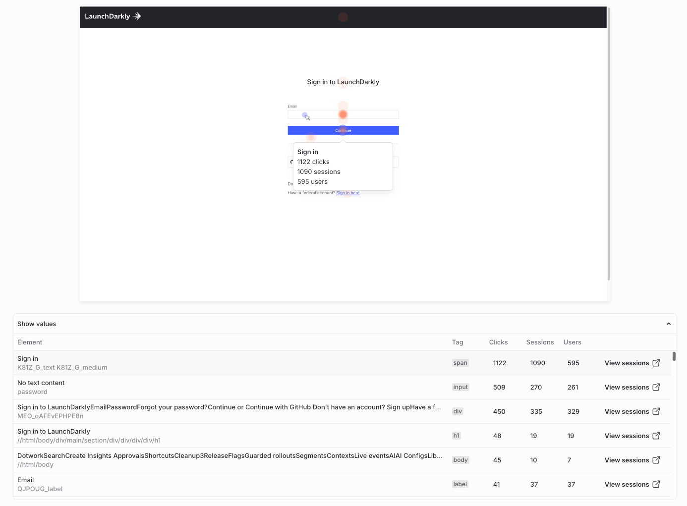
A heat map is a map of clicks or taps shown over a session background. A heat map provides a visual layer that aggregates those user interactions into color-coded intensity maps over your app or website.
13. (Optional) Toggle **Exemplars** on to overlay the individual metric measurements behind the aggregated values. Each exemplar overlay links to the trace or session that recorded the metric. The **Exemplars** option appears only for line charts that use "Observability metrics" as the source. To learn more, read [Metric exemplars](/docs/home/observability/metric-exemplars).
14. Click **Save**. The new graph appears in the dashboard.
### Creating a categorical graph
A categorical graph shows discrete values of a measurement across different categories. Categorical graphs typically use bar charts to visually show the value of each category compared to others, with the higher values appearing first in the series.
Use categorical graphs any time you want to compare a given measurement across some category that produces the measurement, for example to display the number of recorded errors by service name over a fixed period of time.
To create a time categorical graph you choose the resources you want to measure and the categories to use for grouping items in the series. Here's how:
1. In a custom dashboard, click **+ Add graph** to display the graph configuration panel.
2. Give your graph a human-readable **Name**.
3. Choose "Categorical" from the **Type** drop-down menu.
4. Choose an option from the **Style** menu to configure how the graph displays data:
* "Bar chart / histogram" (the default) uses a vertical bar for each category to show the value of each category across the x-axis of the graph.
* "Line chart" uses a single vertical line with entries to show the relative values of different categories.
* "Table" shows the numerical values of each category.
5. (Optional) Select how to stack visualizations, which lets you compare measurements from multiple categories.
* For bar charts, toggle **Stack bars** on to display multiple bars stacked on top of each other.
* For line charts, toggle **Stack area** on to display multiple areas stacked on top of each other.
6. Choose a **Source** from the dropdown. You can populate each graph with data from any of the following:
* Logs
* Traces
* Sessions
* Errors
* Events
* Observability metrics
7. (Optional) Select a **Function** from the dropdown to determine how data points are aggregated. "Count" is selected by default. If you choose a function, such as "Min," that requires a parameter, select the attribute to use as well.
8. (Optional) To add an additional function, click **+ Add function**.
9. (Optional) Toggle **Filter** on to select which data points to include in your graph. For example, if you only want to include data from the production environment, set the `environment` filter. To learn more about the filter syntax, read [Search specification](/docs/home/observability/search).
10. (Optional) Toggle **Group by** on to group your query results into separate series. Use the dropdown to choose the category by which to group results. For example, you might group your logs by level.
11. (Optional) Specify a **Limit** to restrict the number of categories displayed, and a function type to determine whether a group should be included in the graph.
12. Choose the **Category field** that provides the value you want to aggregate results for each category.
13. Specify the maximum number of category entries to display in the **Category count** field.
14. Click **Save**. The new graph appears in the dashboard.
### Creating a funnel graph
A funnel graph displays the percentage of unique contexts that are measured at different different steps of a process, typically from steps that represent a marketing funnel. Funnel graphs typically show a reduction in the percentage of unique contexts at each stage of the funnel, with the final stage representing a successful conversion event, such as a subscription or a completed purchase.
For example, you might create a funnel graph that displays the percentage of unique `user` contexts that generate events at each of these steps:
1. Visiting a sale page.
2. Clicking an "Add to cart" button to create or update a shopping cart.
3. Completing a purchase.
4. Choosing an option to join a loyalty club or agree to marketing correspondence.
Funnel graphs use product analytics events as the source measurement for each step of the funnel. To learn more, read [Product analytics events](/docs/home/observability/product-analytics).
To create a funnel graph you choose the events to measure at each step of the funnel, then select a context kind to monitor through the funnel. Here's how:
1. In a custom dashboard, click **+ Add graph** to display the graph configuration panel.
2. Give your graph a human-readable **Name**.
3. Choose "Funnel" from the **Type** drop-down menu.
4. In the **Compare to** menu, choose how to calculate the percentage of unique contexts at each step of the funnel:
* "Previous step" (the default) calculates the percentage in comparison to the previous step of the funnel.
* "First step" calculates the percentage in comparison to the very first step of the funnel.
5. Click the **Step 1** drop-down menu to select the product analytic event you want to measure at the first step of the funnel. Use the filtering buttons to show available events, then choose one event to measure:
* **All** shows all available product analytics events.
* **Track** shows events that occur when your code uses the `track()` method to generate a custom LaunchDarkly metric event.
* **Click** shows click events that occur at a configured URL.
* **Page view** shows events when a user loads a specific page of your application.
6. Click **+ Add step** and select the event to measure for the next step of your funnel. Continue adding steps as necessary to fully describe the marketing funnel you want to display.
7. (Optional) Toggle **Filters** on to configure a filter that applies to all events in the funnel steps. You can also configure filters for individual steps by clicking **Add filter** next to the step configuration.
8. Choose one or more **Context keys** to measure unique contexts that generate the event at each step of the funnel.
9. Click **Save**. The new graph appears in the dashboard.
### Creating a heat map
A heat map is a map of clicks or taps shown over a session background. A heat map provides a visual layer that aggregates those user interactions into color-coded intensity maps over your app or website.
 ## Advanced graph creation tools
The graph editor provides dashboard variables, an advanced graph creation tool that you can use to parameterize graphs.
### Dashboard variables
Dashboard variables let you parameterize filters, bucketing, and grouping across multiple graphs. This makes it easier to make changes to sets of graphs at one time. After you create a dashboard variable, you can reference it in any of the filter, function, grouping, or bucketing rules components of the graph editor.
## Advanced graph creation tools
The graph editor provides dashboard variables, an advanced graph creation tool that you can use to parameterize graphs.
### Dashboard variables
Dashboard variables let you parameterize filters, bucketing, and grouping across multiple graphs. This makes it easier to make changes to sets of graphs at one time. After you create a dashboard variable, you can reference it in any of the filter, function, grouping, or bucketing rules components of the graph editor.
 5. Click **Save**.
6. In any of the filter, function, grouping, or bucketing rules components of the graph editor, reference your variable by entering a dollar (`$`) followed by the variable's **Name**, for example, `$environment` or `$emailAddress`.
5. Click **Save**.
6. In any of the filter, function, grouping, or bucketing rules components of the graph editor, reference your variable by entering a dollar (`$`) followed by the variable's **Name**, for example, `$environment` or `$emailAddress`.