


It’s been about a year and a half since we introduced a new and improved LaunchDarkly experience, a major redesign that unified environments, improved navigation, and created more clarity across the app.
Since then, our platform has expanded, and our navigation has expanded with it. Over time, the number of items and icons multiplied, and things started to feel a little overwhelming. Our customers provided consistent commentary: “I can’t see what matters most.” “The shortcuts are buried.” “It’s powerful, but it’s a lot.” We prioritized a refresh based on this feedback.
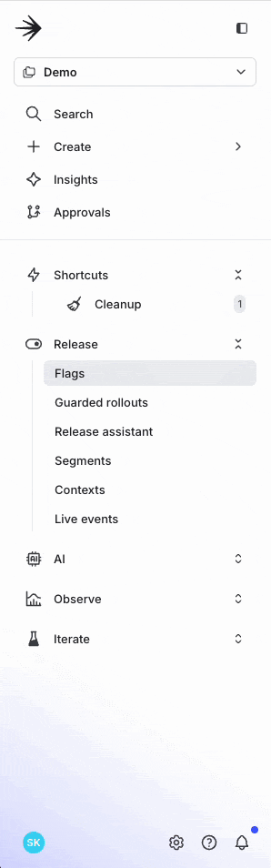
This update makes the navigation cleaner, more focused, and better aligned with how you actually work. It helps keep what’s important in view and gives you back control of your screen real estate.
Here’s what’s new:
- Collapsible sections so you can keep open the sections you interact with the most and hide what you don’t. Your layout will stay exactly how you leave it, even on page refresh.
- Simplified visuals with fewer icons and improved spacing, making it easier to scan the navigation and find what you’re looking for.
- Shortcuts moved up for faster access to your most frequently visited flags. If you haven’t tried this feature before, Shortcuts let you bookmark filtered views of your flags dashboard for quick access to the flags you work with most.
- A refined Create action that remains easy to find but no longer competes with key actions on the page.
- An improved search experience that offers quick, keyboard-friendly access to any part of the platform.
These changes are now available to all LaunchDarkly users.
This work builds on the progress we’ve made over the past year and a half. It reduces visual noise, adds flexibility, and helps teams move faster and stay focused. We’re excited for you to experience it, and we’d love to hear what you think. Share your reaction with us at feedback@launchdarkly.com.
Like what you read?
Get a demo